

January 24, 2019
Creating smooth and stunning web apps is extremely important in 2019. In one study, researchers found that over 50% of users ignore the website due to the lousy user experience. Another study found that responsive design can increase the conversion rate by over 200%.
Today, you cannot afford to ignore the design aspects of your web apps and websites.
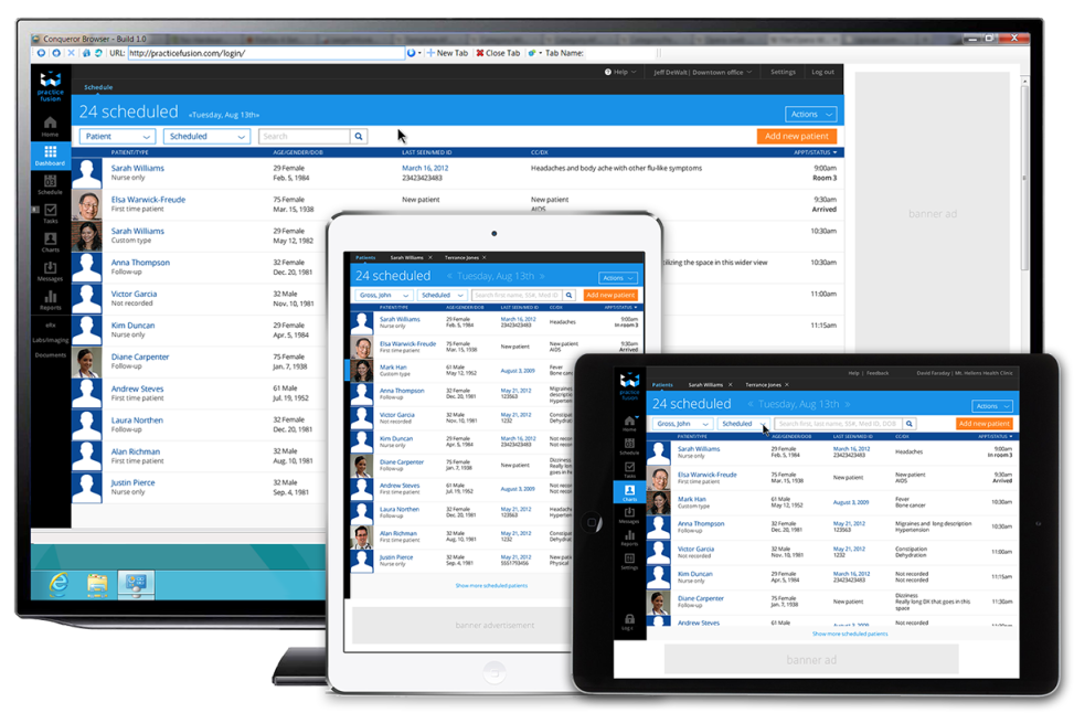
Image Source: STEFAN CLOCEK
Angular and Bootstrap 4 are both common tools to create responsible web apps. Many people often use these tools separately. In this article, I will show you what you can expect if you combine these two powerful tools.
Angular is an extremely popular front-end web application framework with tons of features. As a developer, you can use angular to create secured applications with minor coding. It is also easier to integrate angular with many third-party frameworks like Wijmo, Ionic, and so on.
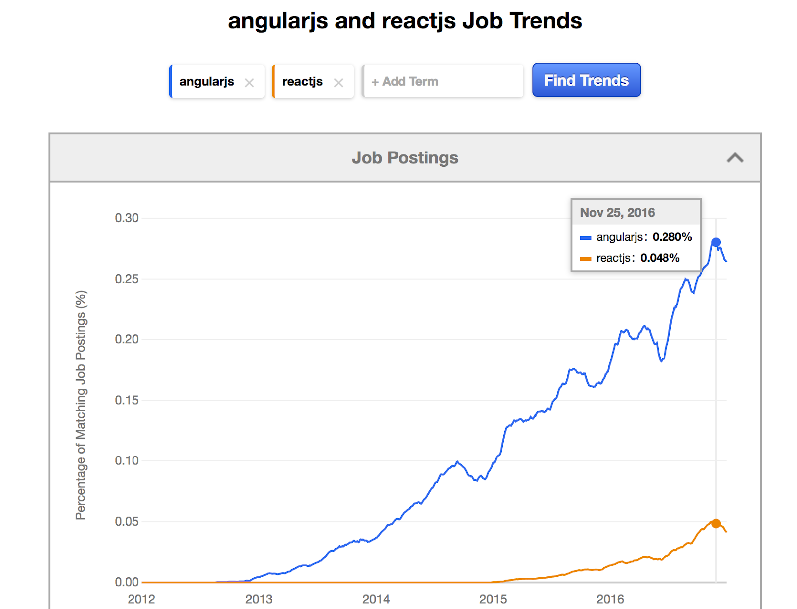
Image Source: TechMagic
To use it to the fullest, you must know how to play with various features of Angular. You can opt for Simplilearn's Angular Course to get a thorough guide on using Angular for creating compelling applications. They offer self-paced and online classroom options for people who want to learn programming and application development.
Another excellent framework for creating web apps is bootstrap. It allows you to select HTML and CSS-based templates from its collection of models for buttons, navigation, forms, and so on.
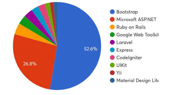
Image Source: OSTraining
Teach me to combine these two amazing frameworks
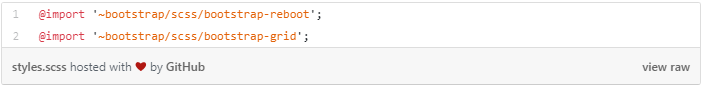
n this article, I will combine Bootstrap 4 and Angular 6 to create amazing responsive apps. For making things simple, I will only use bootstrap-reboot and bootstrap-grid packages.
At first, let’s use an Angular CLI’s ng for creating a new project.

After the installation, we will take a look at our main styles.scss file in the source (src) folder. Here are the codes to insert now.
It is now time to use Bootstrap responsive grid with Angular.
The next method of completing the task is to add minified Bootstrap distribution into the angular.json file. Here is an example.
https://gist.github.com/danishwa/8665d02b1af6b65b4e815bbe0e120eff
One of the advantages of importing Bootstrap grid to style.scss file is that it allows us to override any Saas variable.
It can also be beneficial to create styles-variables.scss file next to styles.scss with responsive layout breakpoints.
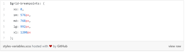
We will now override Bootstrap grid with styles-variables.scss for creating custom responsive styles.
It is possible now to use styles.scss with Bootstrap to other component styles file.
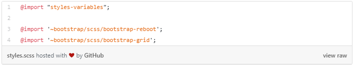
We will be using Import-styles-variables.scss alongside styles.scss file.
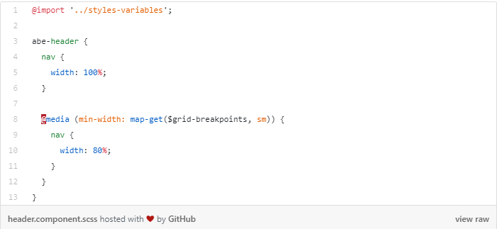
The combination of the custom component, i.e., header.component.scss with import styles-variables.scss for the implementation of consistent custom responsive styling.
Creating a responsive layout
It is incredibly easy to create responsive designs with the help of Bootstrap reboot and grid. We will see how it works with the least effort.
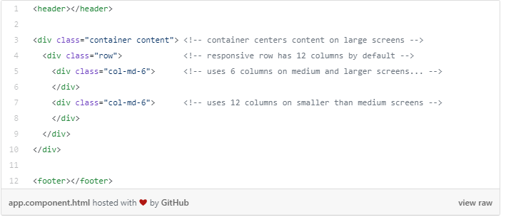
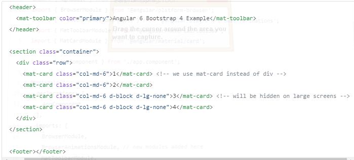
The layout will contain header, footer, and content. We will include two sections in the material. We aim to display them side by side in the case of the large screen while showing them as a single chunk for the small screen.
In our example, every bit of our layout will run inside of AppComponent.
Basic responsive grid classes
Inside “.container class” we can find layout elements to make it a bit narrower and centered on the case of large screen size. You can skip .container when you are dealing with the dashboard. In the next wrapper element, we will use .row class for signifying responsive row.
We can specify columns using the .col class. We use it for super-small screen size. The modifiers like -sm -md -xl -lg will also help us to limit its impact to specific screen size. There is a need of appropriate disk space for columns, depending on the count. In the real world, we can explicitly specify column size. For instance, it is possible to have a row with .col-md-8 and .col-md-4, which makes it 12 columns.
Responsive helper classes
Building high-responsive layouts should be adjusted, according to various screen size and devices. Furthermore, the content of the specific element must also be responsive. For instance, in smaller screen, you might want to display the only logo and ignore the name of the company due to a smaller screen size.
Responsive helper classes are implemented differently in Bootstrap
The current responsive Bootstrap looks better with CSS. It means that we now use “
” in the place of “”.We are starting here by setting display none for smaller screen size. We override it by using the block in the case of the small and large screen.
We use “
Time to combine Bootstrap with Angular
It is not wise to write codes from scratch to achieve results fast. We use “npm i -S @angular/material @angular/cdk @angular/animations” for adding Angular material. We can also import from our “AppModule” file.
For “MatToolbarModule” and “MatCardModule”…
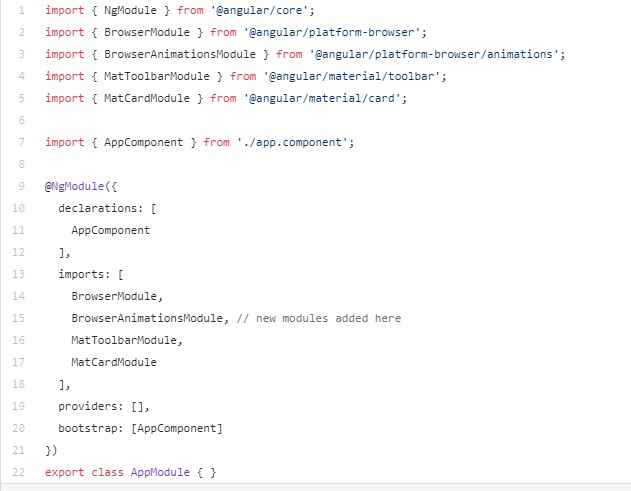
I have imported some Angular material modules to be able to use in my app.
It is also possible to make some adjustment like this:
The final part is to import pre-built Angular material themes into styles.scss.
Over to You
The demand for front-end developers is increasing. You would be surprised to know that many programmers only code at work. If you show employers that you have a firm grasp of both bootstrap and angular, they are incredibly likely to get in touch with you.
Employers know the importance of creating beautiful and responsive web apps. Just show them how you can combine bootstrap and angular to develop responsive web apps by demonstrating some samples in your portfolio to land a high paying job or project.