January 05, 2017
I'm a big fan of Angular Material2 and I have been using it from the alpha version. Unfortunately Material2 didn't have any flex layout system so you needed to use an external one.
When Material2 beta1 was released they updated the readme.md file with amazing news:
layout
-
-
this library is still in beta1 but according to my experience it looks stable and ready to use and you don't need Angular Material2 or any other frameworks to use it.
Angular Flex Layout provides a sophisticated layout API using FlexBox CSS + mediaQuery.
This module provides Angular (v2.x and higher) developers with component layout features using a custom Layout API, mediaQuery observables, and injected DOM flexbox-2016 css stylings.
The Flex Layout engine intelligently automates the process of applying appropriate Flexbox CSS to browser view hierarchies. This automation also addresses many of the complexities and workarounds encountered with the traditional, manual, CSS-only application of box CSS.
To install it run:
npm install @angular/flex-layout -save
And then import the FlexLayoutModule:
[gist id="f1240ae9a70f7547df1f3ba78e5d7836"]
The public Layout API is a simple list of HTML attributes that can be used on HTML containers and elements.
API for DOM containers:
HTML API
Allowed values
fxLayout
row | column | row-reverse | column-reverse
fxLayoutAlign
start|center|end|space-around|space-between``start|center|end|stretch
fxLayoutWrap
"" | wrap | none | nowrap | reverse
fxLayoutGap
%, px, vw, vh
API for DOM elements:
fxFlex
"" , px , %, vw, vh, " ",
fxFlexOrder
int
fxFlexOffset
%, px, vw, vh
fxFlexAlign
start|baseline|center|end
fxFlexFill
API for any element:
HTML API
Allowed values
fxHide
TRUE, FALSE, 0, ""
fxShow
TRUE, FALSE, 0, ""
Breakpoint aliases:
breakpoint
mediaQuery
""
'screen'
xs
'screen and (max-width: 599px)'
gt-xs
'screen and (min-width: 600px)'
sm
'screen and (min-width: 600px) and (max-width: 959px)'
gt-sm
'screen and (min-width: 960px)'
md
'screen and (min-width: 960px) and (max-width: 1279px)'
gt-md
'screen and (min-width: 1280px)'
lg
'screen and (min-width: 1280px) and (max-width: 1919px)'
gt-lg
'screen and (min-width: 1920px)'
xl
'screen and (min-width: 1920px)'
Now that we know all the directives let’s try to use them.
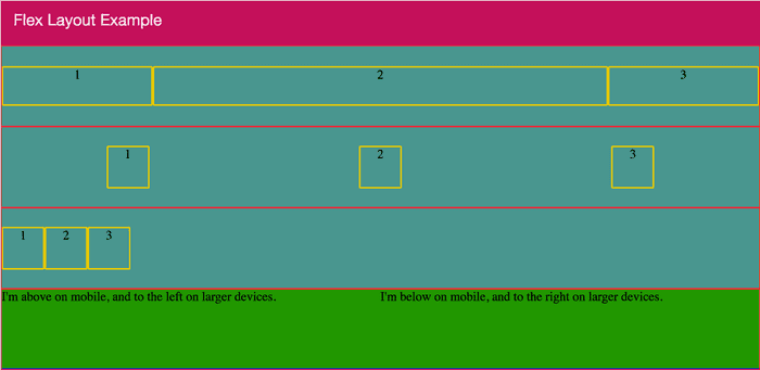
[caption id="attachment_7090" align="aligncenter" width="1024"]
 Flex layout example[/caption]
[gist id="ea46e63637354384e72784a461a1e8a6"]
Let's explain each section:
- On the first row (line 6 to 10) I set the first block on 20% width, the second 60% and the third fill the remain space.
- On the second row (line 13 to 17) the horizontal alignment is space-around and vertically is center.
- On the third one (line 20 to 24) the horizontal alignment is begin and vertically is center.
- On the forth one (line 27 to 33) the two block are horizontally aligned by default and for smaller devices (xs and sm) are vertically aligned.
Of course this post doesn’t show all the features of this amazing library but if you want to become a master have a look at the official documentation.
If you enjoyed this post follow me on twitter @Dzurico!
